Lady in Charcoal:
In this drawing, the instructor wanted us to use newspaper as the middle tone and we drew from a nude model. This turned out so nicely, it was chosen to be in the art show that semester. The frame was found in a thrift store by my teacher. I matted the work and painted the frame black.
In this drawing, the instructor wanted us to use newspaper as the middle tone and we drew from a nude model. This turned out so nicely, it was chosen to be in the art show that semester. The frame was found in a thrift store by my teacher. I matted the work and painted the frame black.

This was from my 3D Design class. A relief pattern is a pattern that builds off a low lying plane. We were instructed to design one that was inspired by nature and I chose mountains. Someday, I hope to nestle this guy in a box frame; I am really happy with how it turned out.


Designing a Letter:
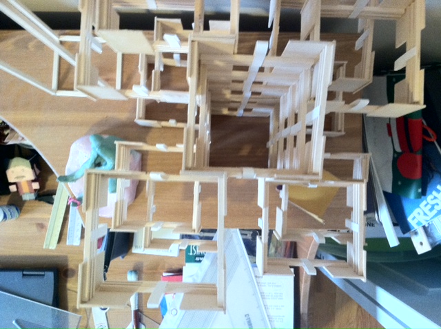
In the same class, 3D Design, we collaborated with a classmate in designing a letter. I chose E & with the help of said classmate, we came up with a pretty great design. The parameters were that we needed to use Bristol, a skinny sized Basswood and a even skinnier sized, but flatter Basswood. I loved working with Basswood; It was so much fun to use the mitre saw! Once the letter design was complete, we had to reproduce the letter and make a design that was based off an axis. The axis is best represented in the last photo.


Color Study: Not sure of the exact project name here, but after choosing a color to work with we played around with its value. After creating a ton of different swatches by adding black & white, a select few were chosen and my image was created. The image was actually pulled from online and we were to change each version by using a string from our palette.

Pixelation: This was fun, but also frustrating in that we could not use the same color next to each other. Keep in mind we had to mix all of the colors on our own! Quite a workout. Overall, I was very happy with the end result.


Intro to Computer Graphics Patterns:


