Proof it can be found in the everyday, such as... food coloring used while making cookies. Gorgeous!
TopLetBack
Well Designed :: Living Room
You may love the starkness of a completely modern room filled with clean, crisp lines or (on the opposite end of that spectrum) a totally eclectic room that is nothing but lush colors & textures. However, it is my opinion the best & most interesting rooms have a mix of both.
If you too belong to my camp of balance, but aren't sure how to exactly mix crisp & eclectic, I hope you find this post helpful. Below is just one, budget-friendly example of creating a balanced feel.
Kilim pillow // $119 // mother's atelier |
A bonus with the chairs, aside from price, is that they're stackable! Grab a couple to break out when you need additional seating. Incorporating pieces with thick textures in deeper hues will lend warmth to the crisp items below creating maximum contrast for a unique & warm feel to your space. Hollah.
left to right:
An Update:
For those who do not follow me on Instagram, here's what I've been up to...
I (and the BF) graduated! |
We were tourists with family in town for the celebration |
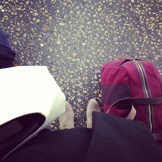
and I took a trip home to see more family. |
With more free time, I got back to my running group |
and took a five-week pottery class. |
With zero school stress, I recommitted to eating healthy, |
but then the BF bought an ice cream maker, ugh-yum! |
I went to an art festival to see a favorite artist, Essimar |
and marveled at the all the love for the Pride Parade. |
The BF's family came to town for the fourth |
and we became tourists once again. |
We showed them the fireworks at Winnemac Park |
and they showed us the view from their rental. |
I continue to snap photos all over town |
and never forget to look up. |
Now, my goals are to complete my current project |
and take advantage of this fine city in Summer! |
all photos are my own.
Business Card Design
This is the last week before graduation and while I have lots to do, I wanted to pop in & share my business card design. It took me forever to decide on a logo and I'm finally happy with it. I plan to share more from my portfolio, so stay tuned!
Back:
Front:
Back:
ps: in loading these photos i noticed two things what won't appear in the actual business card.
1. the arrow on the front will actually bleed off the card
2. on the back, there is no white border around the card, like you see in the image above
Logo Design
The class I'm most excited about this semester is Portfolio/Resume Preparation. It's daunting having to create your "brand" knowing the end result will be your "face" during interviews. That said, it's still exciting! Right now we are in the process of designing our logos. I find myself not wanting to stop and getting excited over discovering a new possibility. Still not sure on a final design, but here's my process work.
Do you have a favorite?
Sketchbook photos
The right side of what I created in Illustrator was mainly just playing around while the left side I'm getting closer to an actual logo.
Frasier fir:
Last weekend we finally removed our dear Frasier fir. It was sad to say goodbye, but it's almost Feb and obviously time. After diligently watering it twice a day for over a month, I finally gave up on that about two weeks ago. I will say, all that I read on the Frasier fir's ability to hang on and stay strong did ring true -- as dead as it was, it still looked perfect. We returned it to where we purchased it since for five bucks they recycle them for the Scouts. Definitely made me feel better about saying goodbye, after all, there was no way I could bear the thought of placing her out with the garbage! I snapped a few pics as the BF did all the work...
...and kudos to our friend who helped us with his car!
The Fresh Home
: : : : : Lagomorph Design : : : : : |
: : : : : CB2 : : : : : |
: : : : : Michael Anastassiades : : : : : |
Subscribe to:
Posts (Atom)